Building a scalable design system for OFX, a global fintech platform

Designed a scalable system that unified UI across products, reduced duplication, and enabled faster design and development workflows
Platform

Design system

Domain

Fintech / Finances

Scope

Design system / Web App

1M+

OFX’s design system now supports a platform used by over 1 million users worldwide.

180+

The platform operates across more than 180 countries and 30+ currencies.

50+

Design consistency is maintained across 50+ regulatory jurisdictions, including ISO 27001 certification.

My role
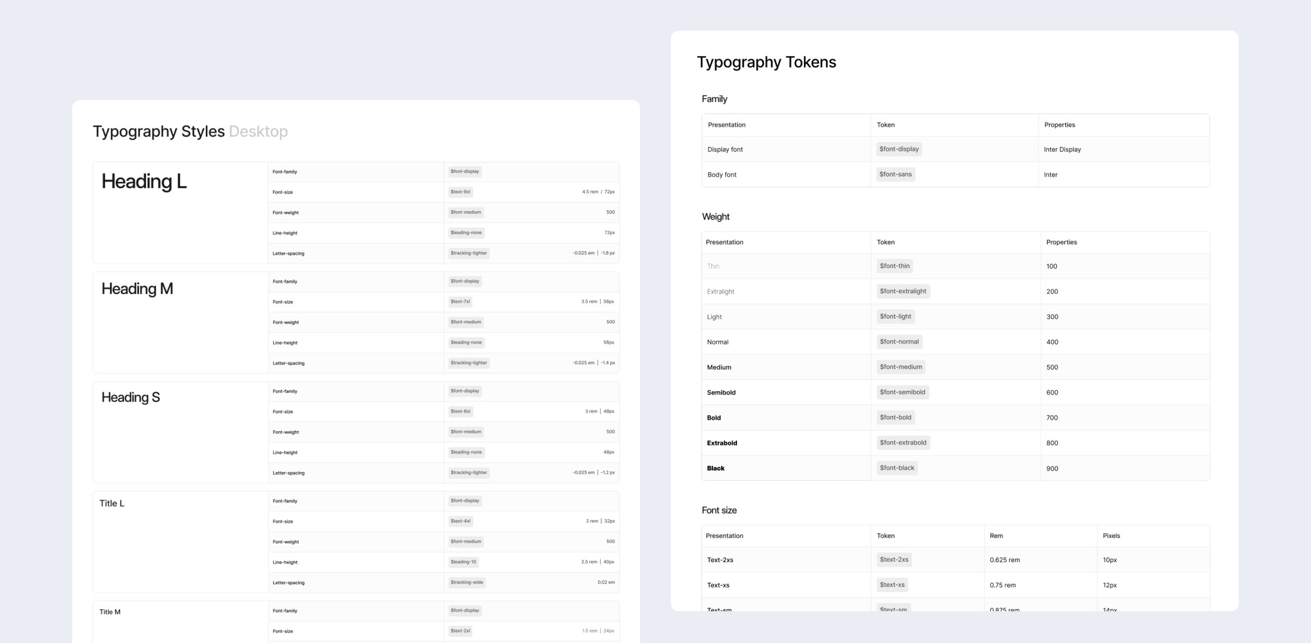
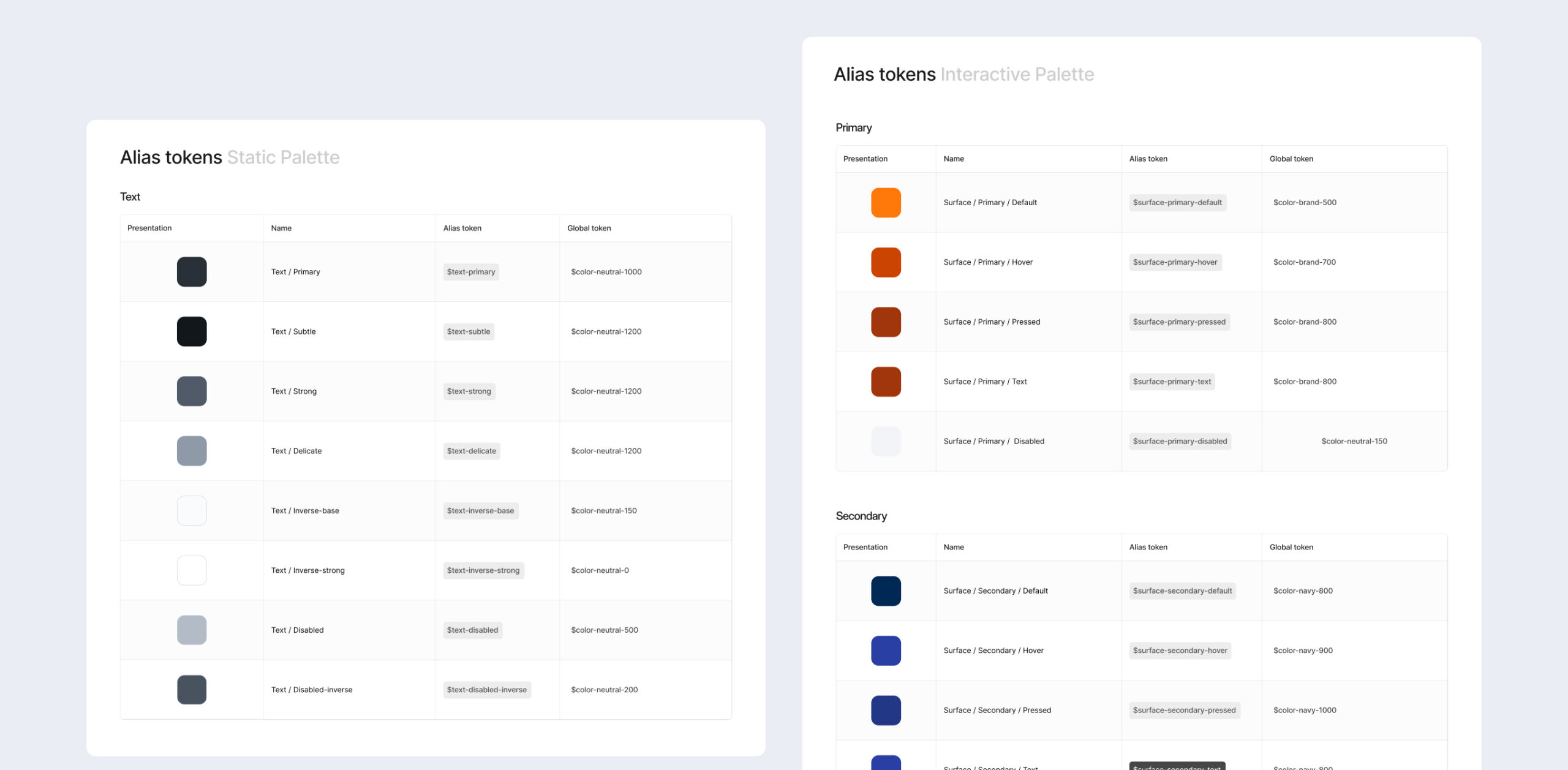
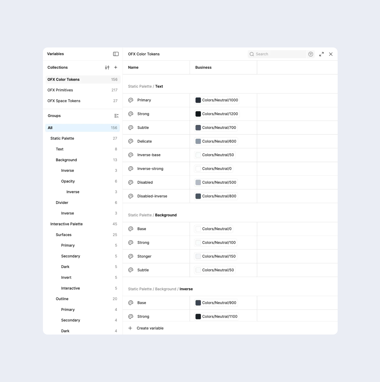
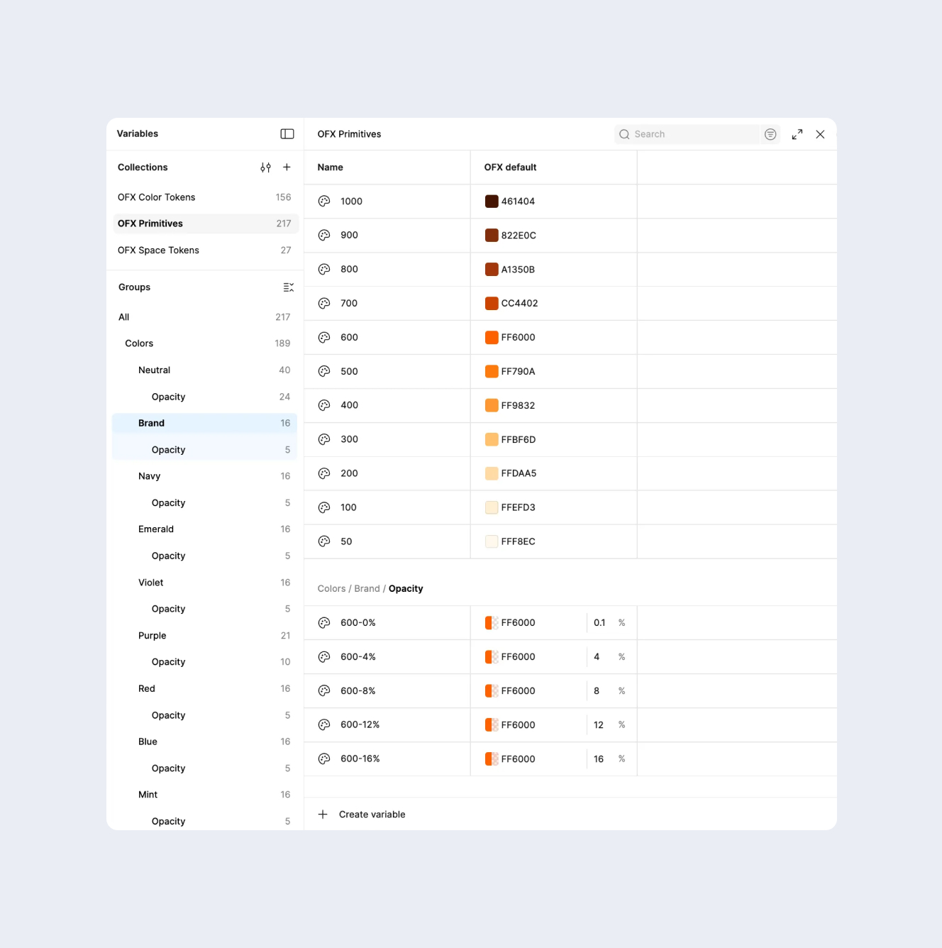
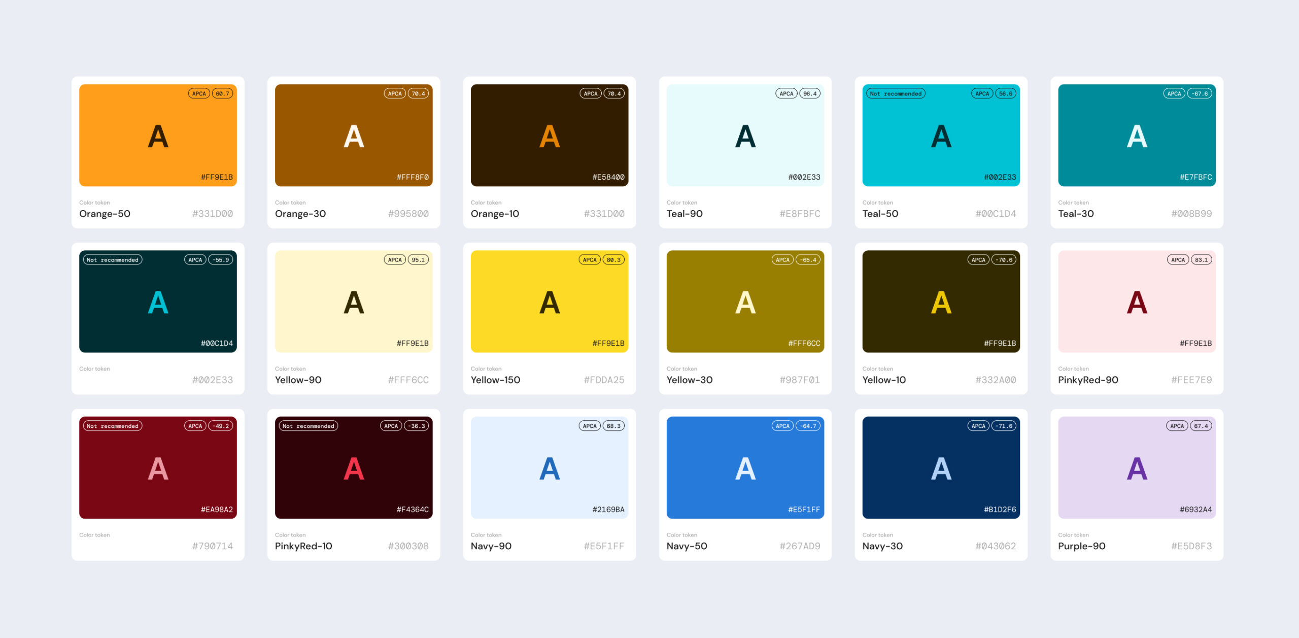
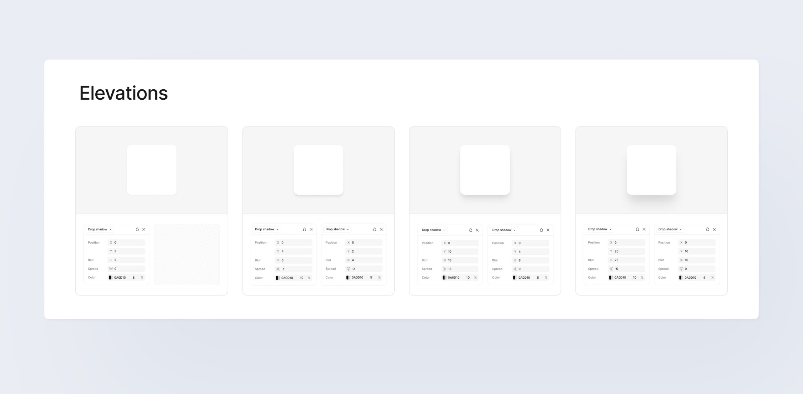
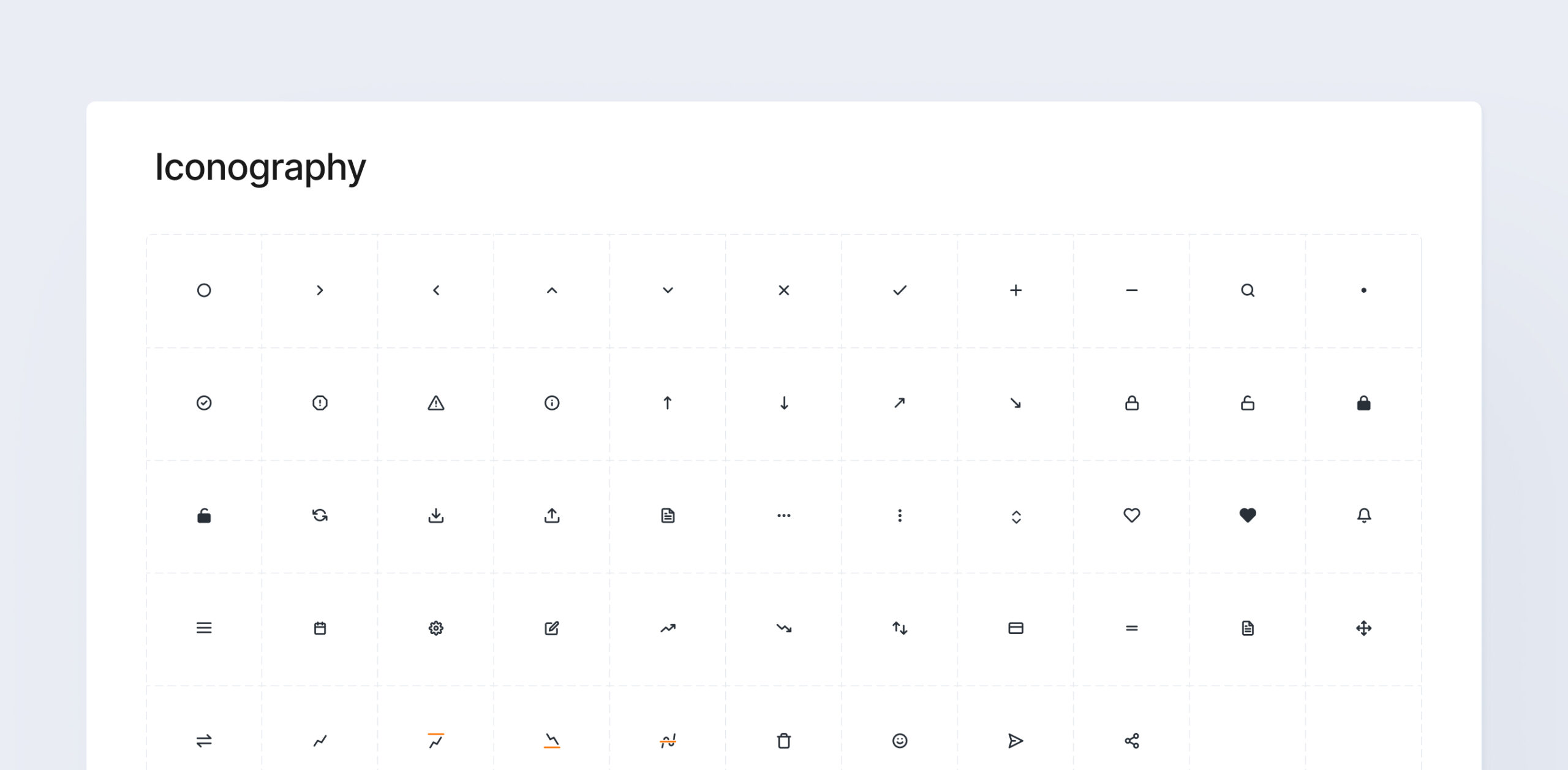
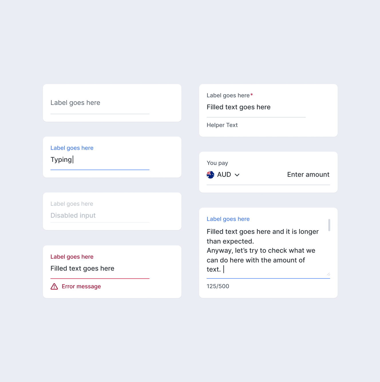
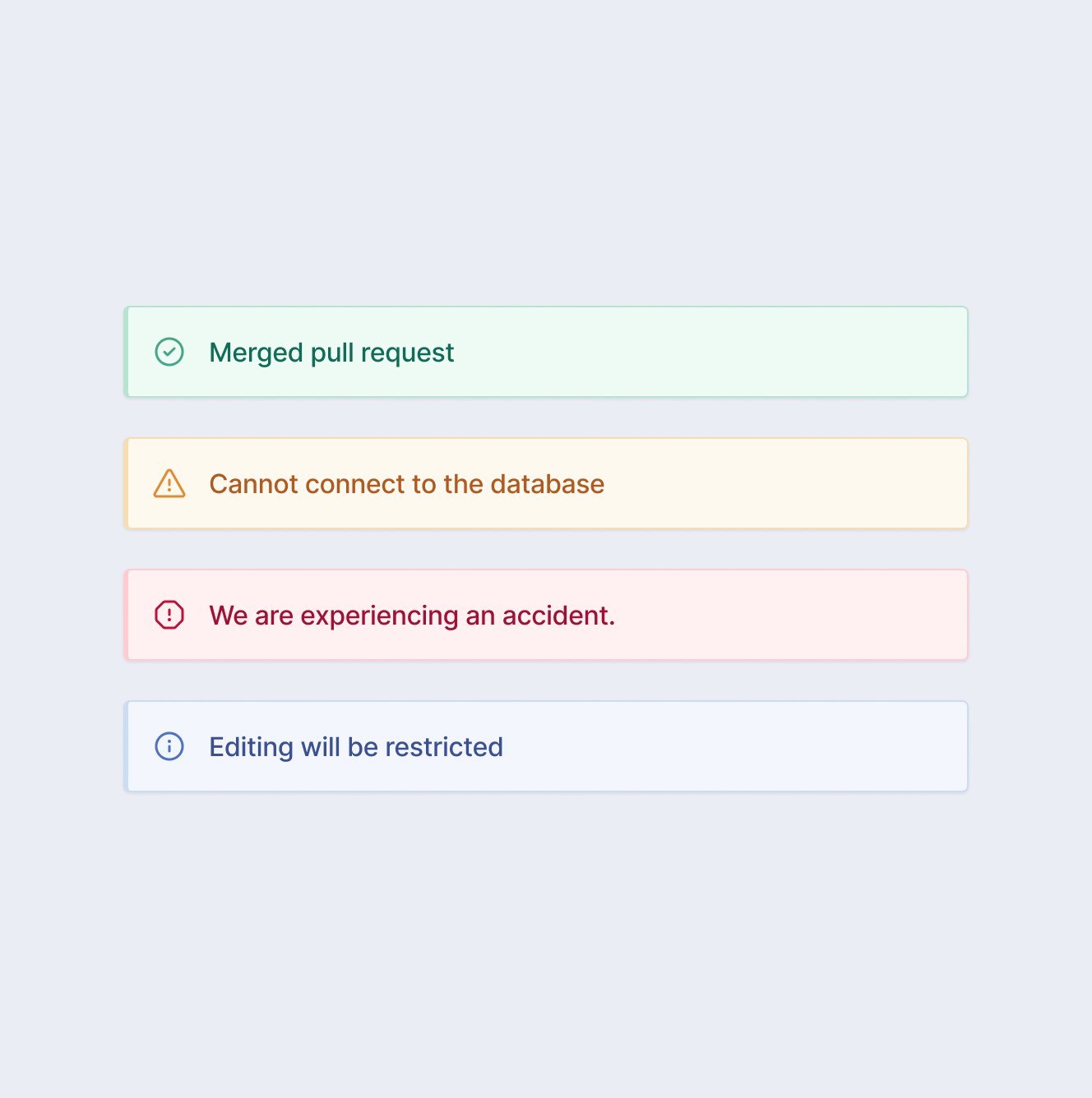
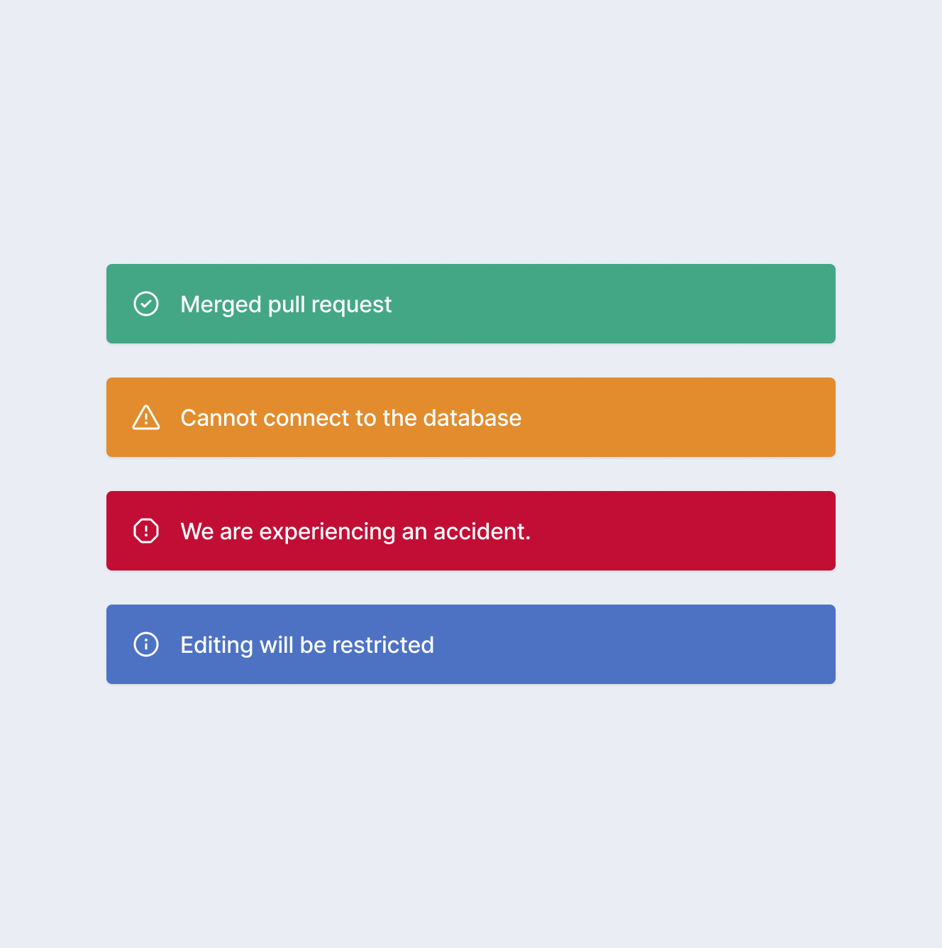
  • Building foundations before features — Since the system was built from scratch, I started with core foundations — design tokens, typography scale, spacing units, and a color system — before designing individual components, so everything built afterward inherited a consistent visual language instead of retrofitting one later.
  • Designing for flexibility over rigidity — I intentionally prioritized flexibility over strict standardization, accepting some variation to ensure the system could support multiple product contexts rather than forcing a one-size-fits-all approach.
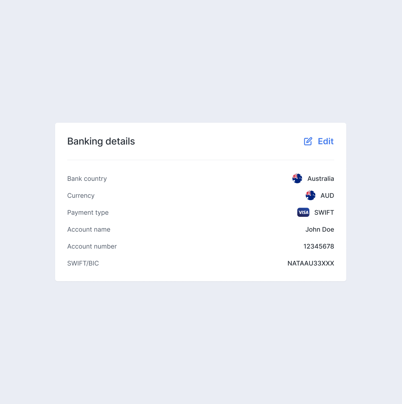
  • Balancing consistency with speed — The system standardizes UI patterns — including typography and spacing — to ensure visual coherence, while still allowing teams to move quickly without introducing friction into their workflows.
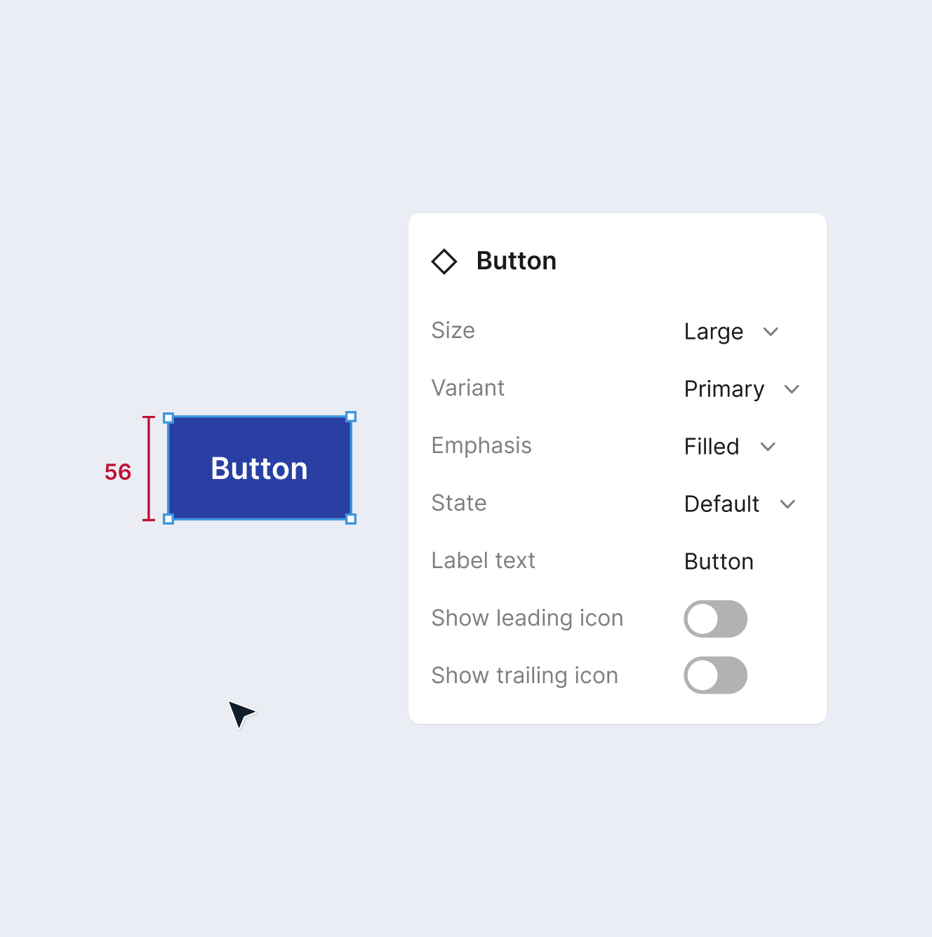
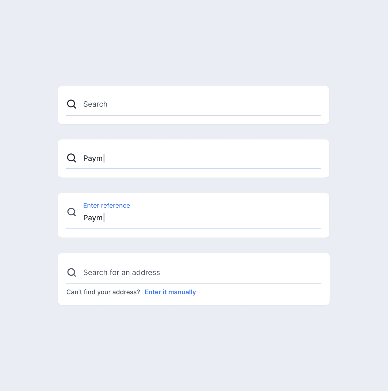
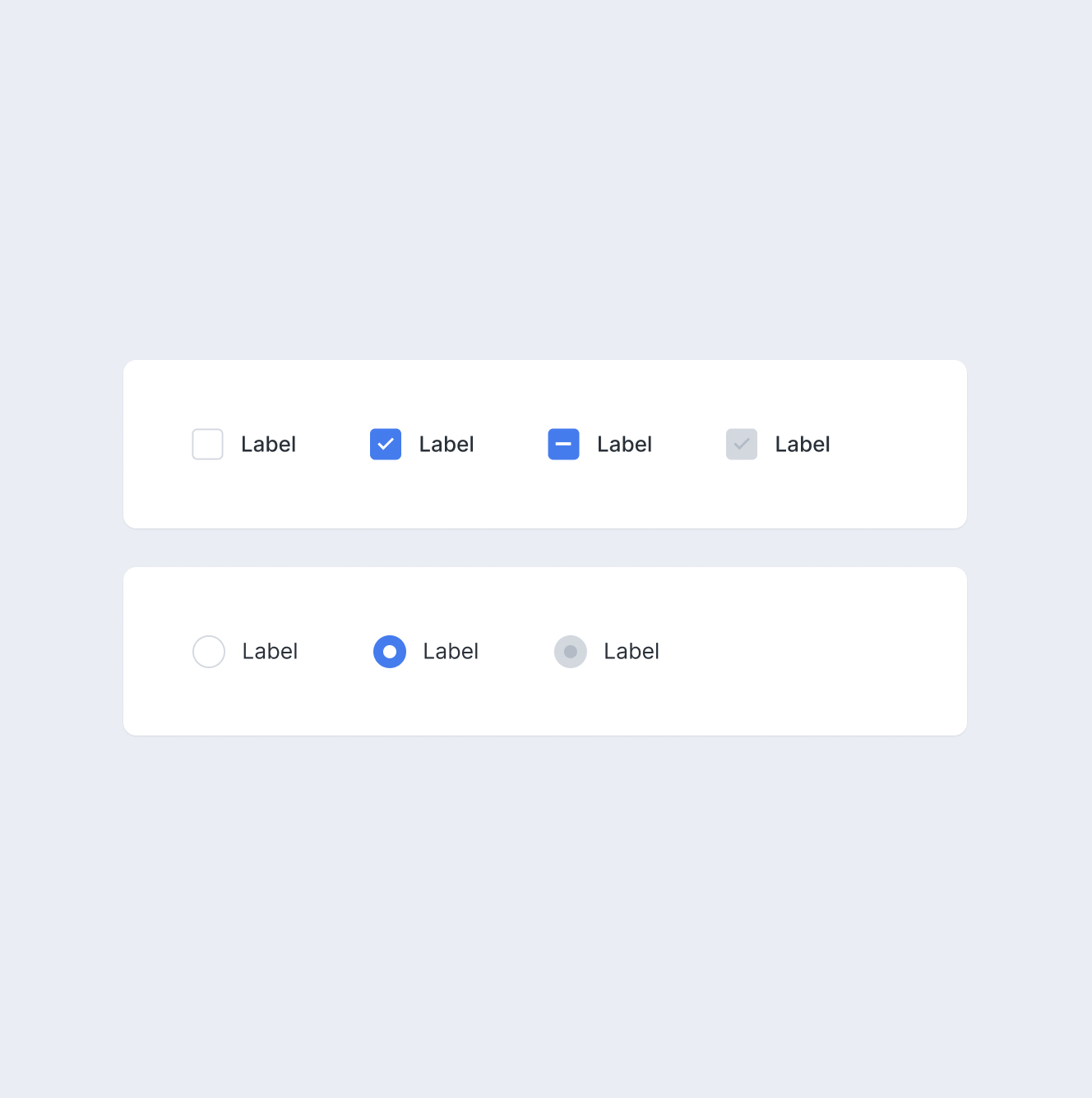
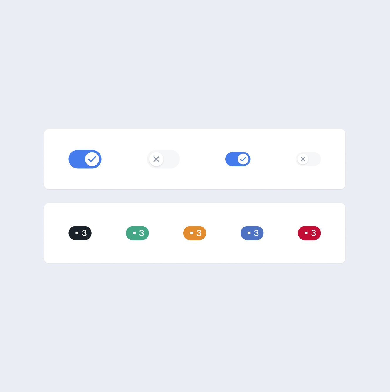
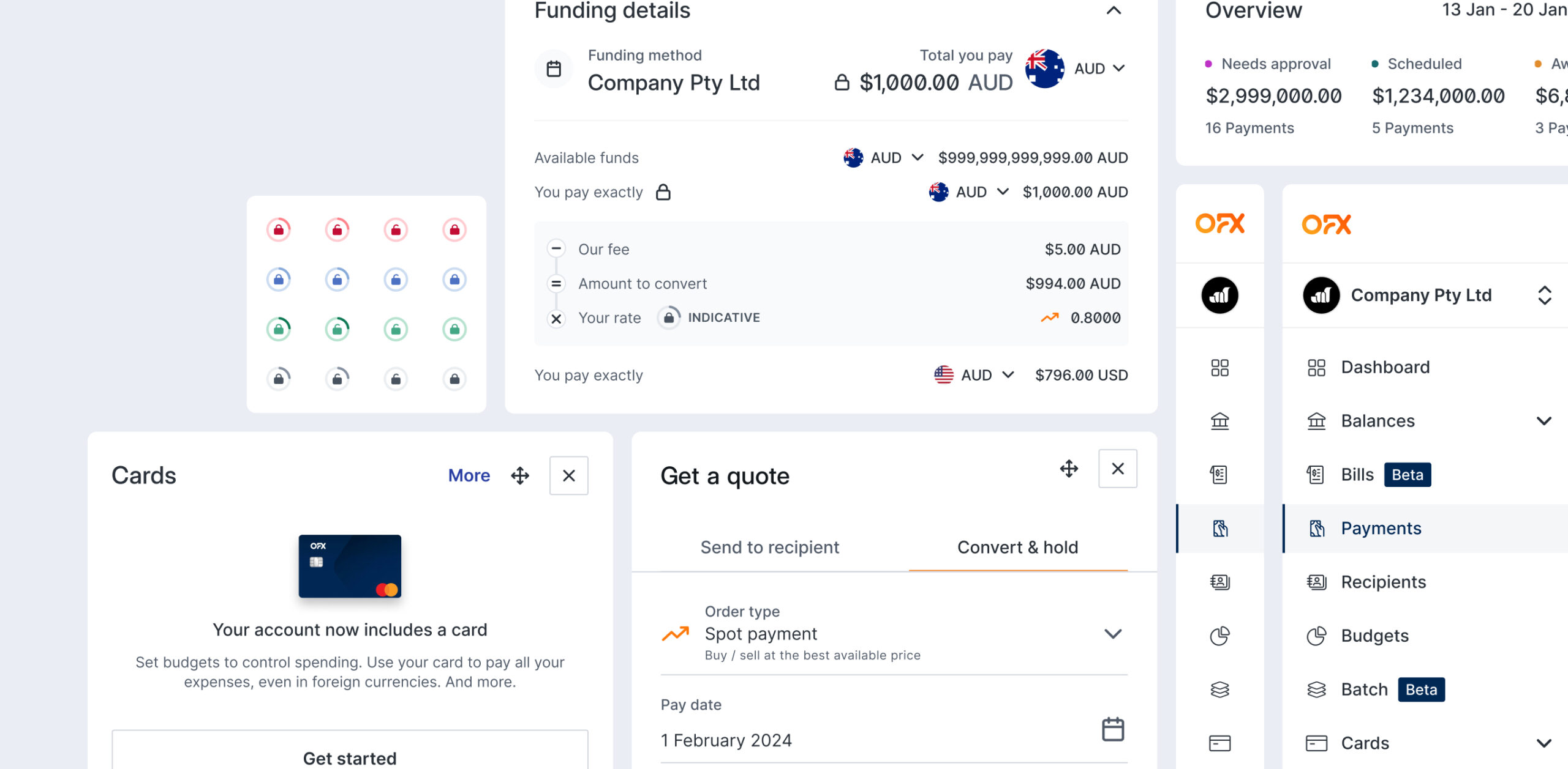
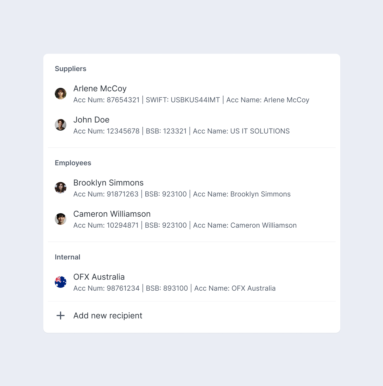
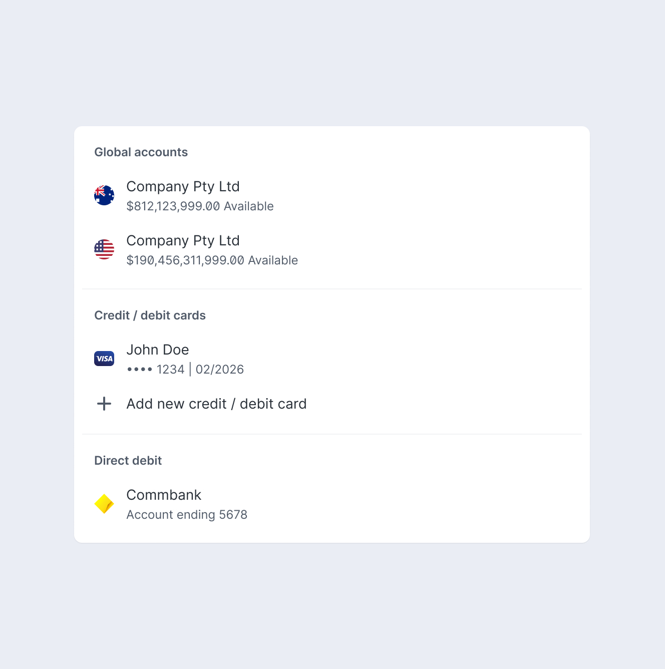
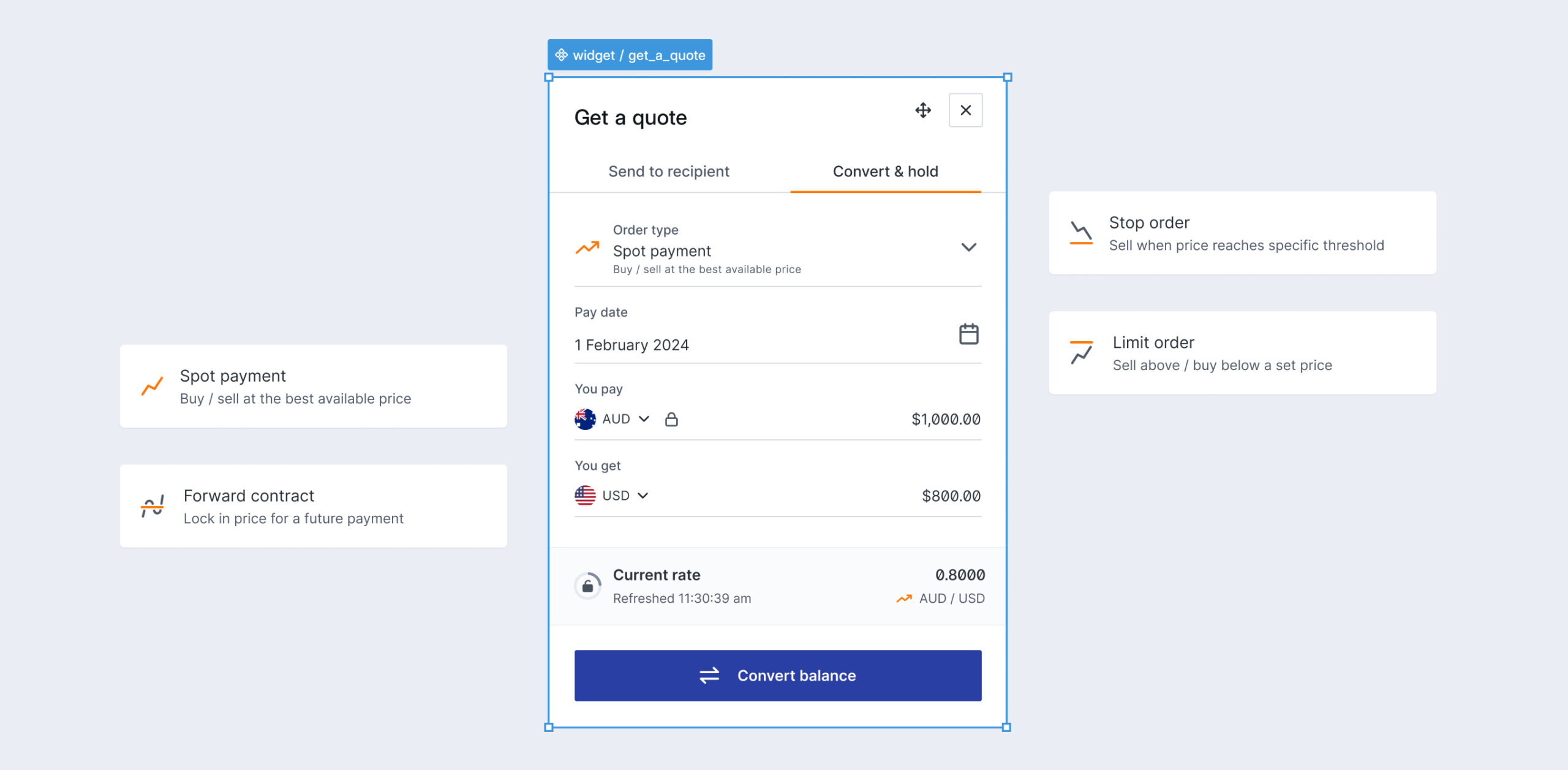
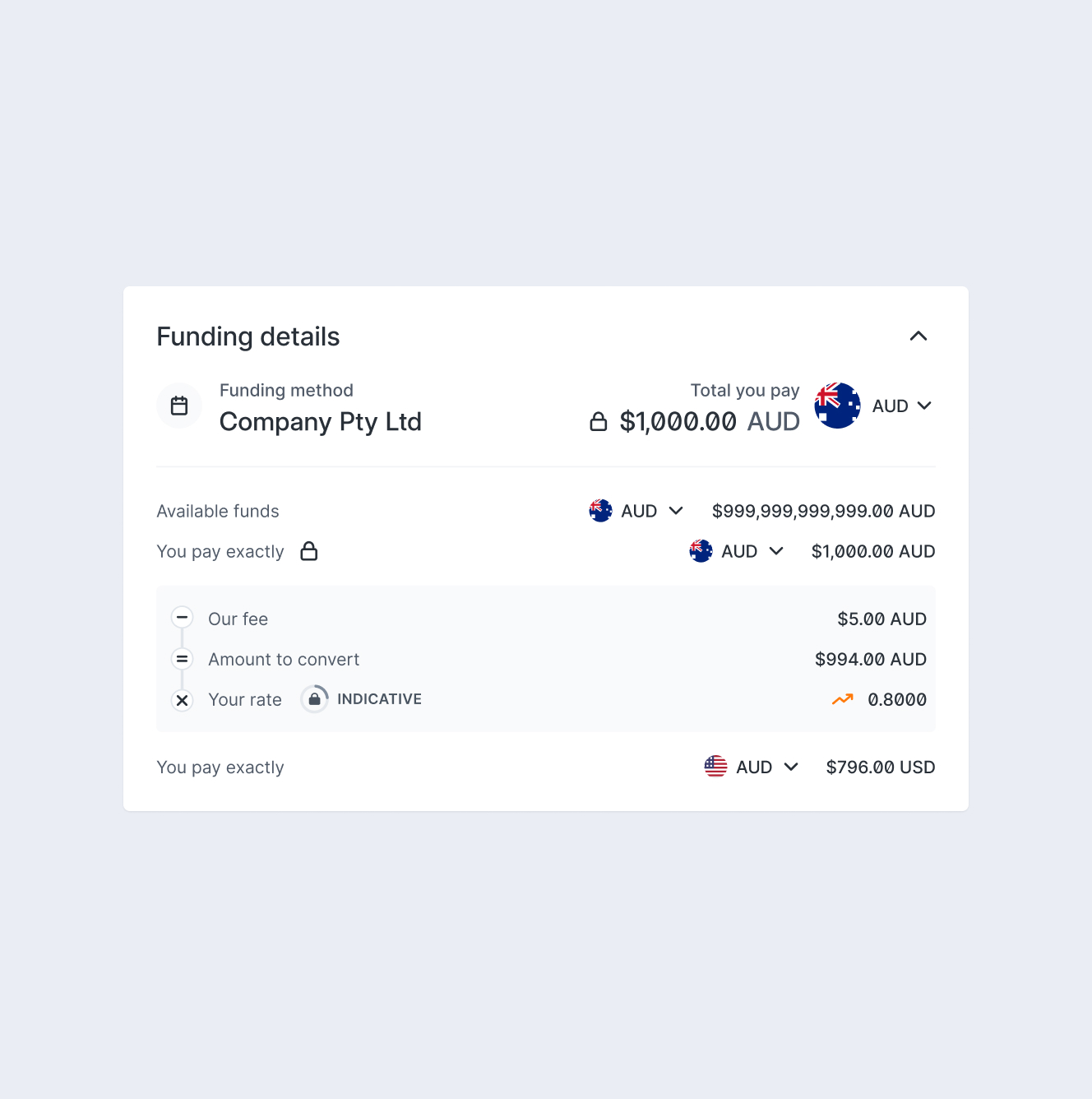
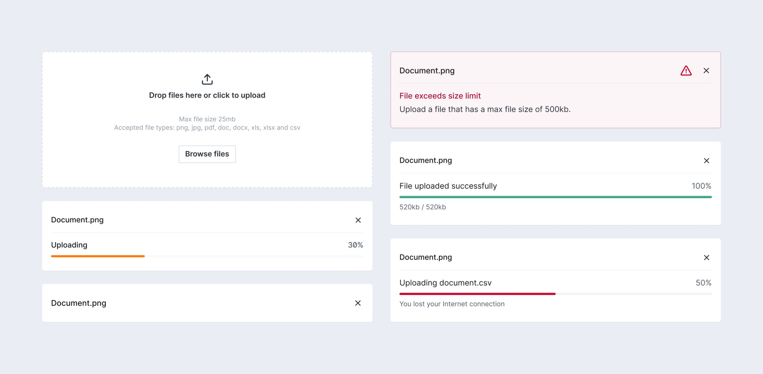
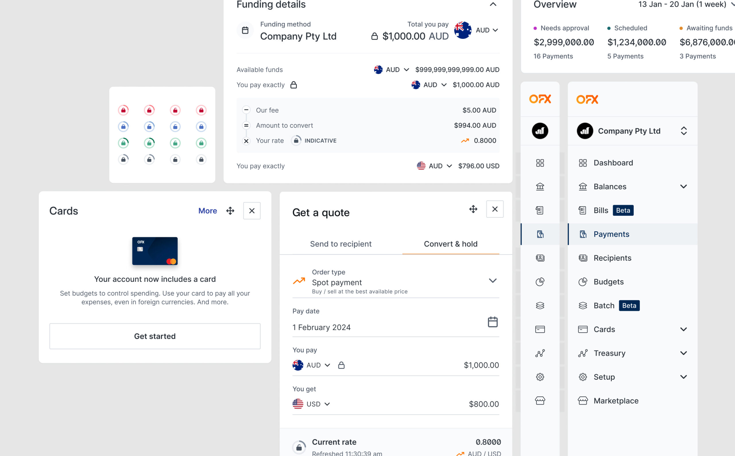
  • Creating reusable, modular components — I designed components as modular building blocks, reducing duplication and improving scalability across different parts of the product. Reusable patterns meant teams could assemble screens faster instead of rebuilding UI from scratch each time.
  • Designing for adoption, not just existence — A design system only creates value if teams actually use it. I worked closely with product squads during rollout, gathering feedback on real use cases to make sure the system solved actual problems rather than becoming a parallel, ignored library.
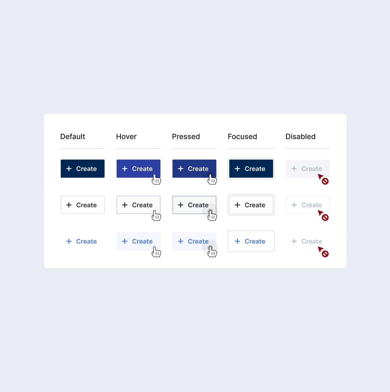
  • Documentation as a scaling mechanism — I treated component documentation — usage guidelines, states, and do’s/don’ts — as a core deliverable, not an afterthought, allowing the system to scale across teams without requiring constant one-on-one design support.
  • Planning for scale from day one — Since the system had to support products still in development, I designed the component architecture to be extensible from the start, avoiding costly rework as new product needs emerged.
The problem

The product lacked a unified design system, leading to inconsistencies across interfaces, duplicated design work, and slower development cycles.

Teams were solving the same problems repeatedly, and the absence of shared patterns made it difficult to scale the product efficiently.
Challenges and Goals

Create a flexible and scalable design system that ensures consistency across the product while enabling teams to design and build faster.

Approach
I focused on building a system that balances consistency with flexibility — ensuring components are reusable and standardized, while still adaptable to different product needs.
Impact

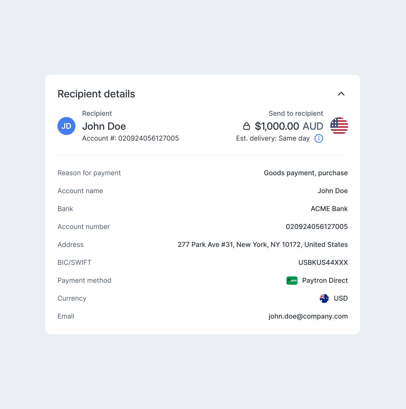
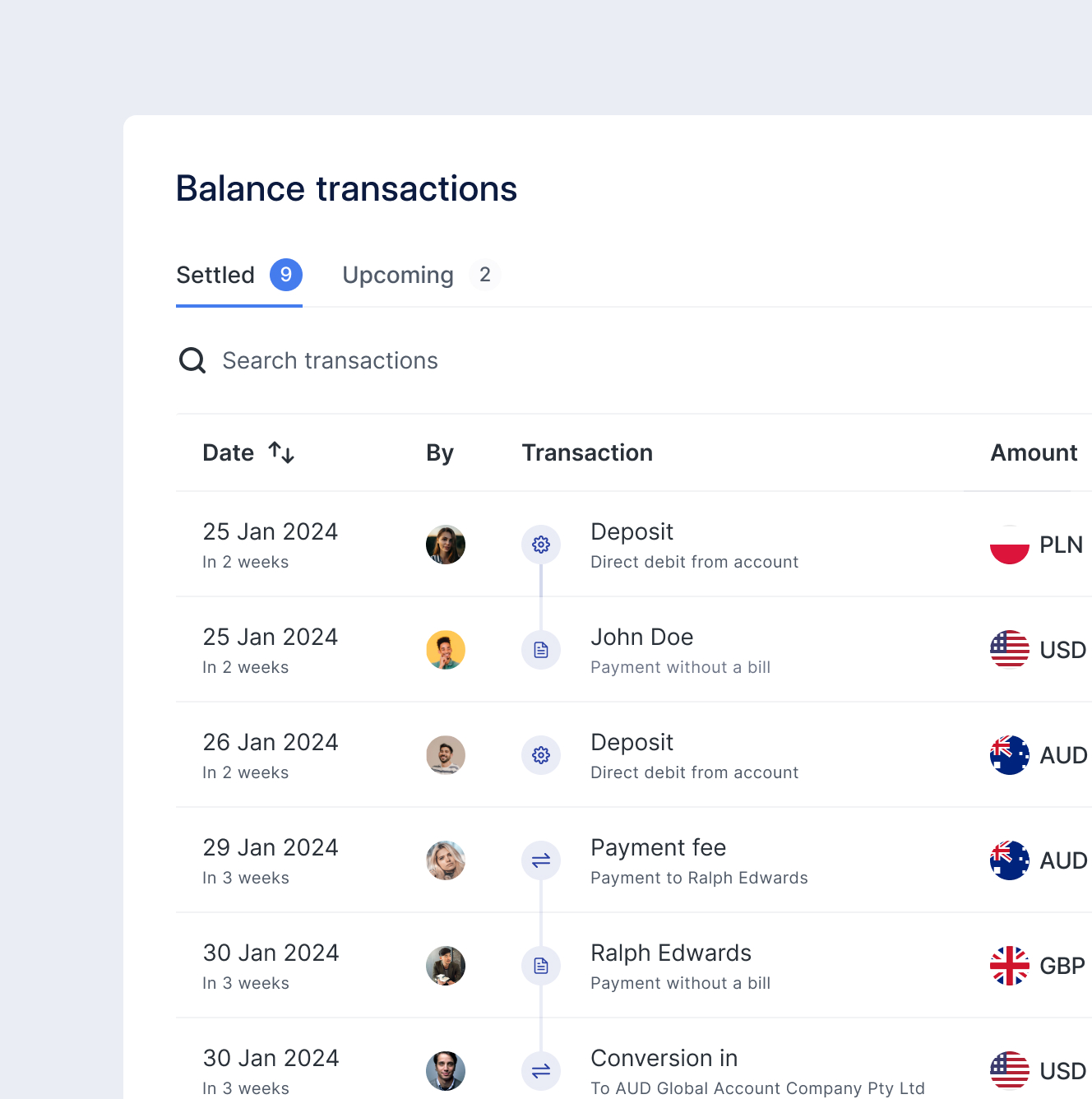
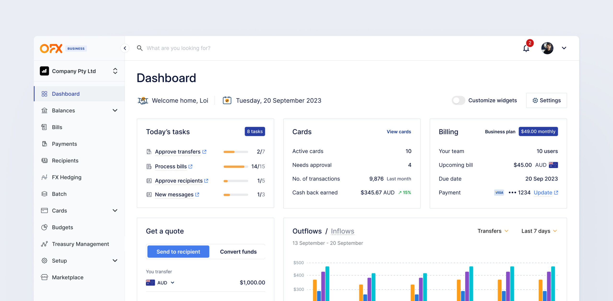
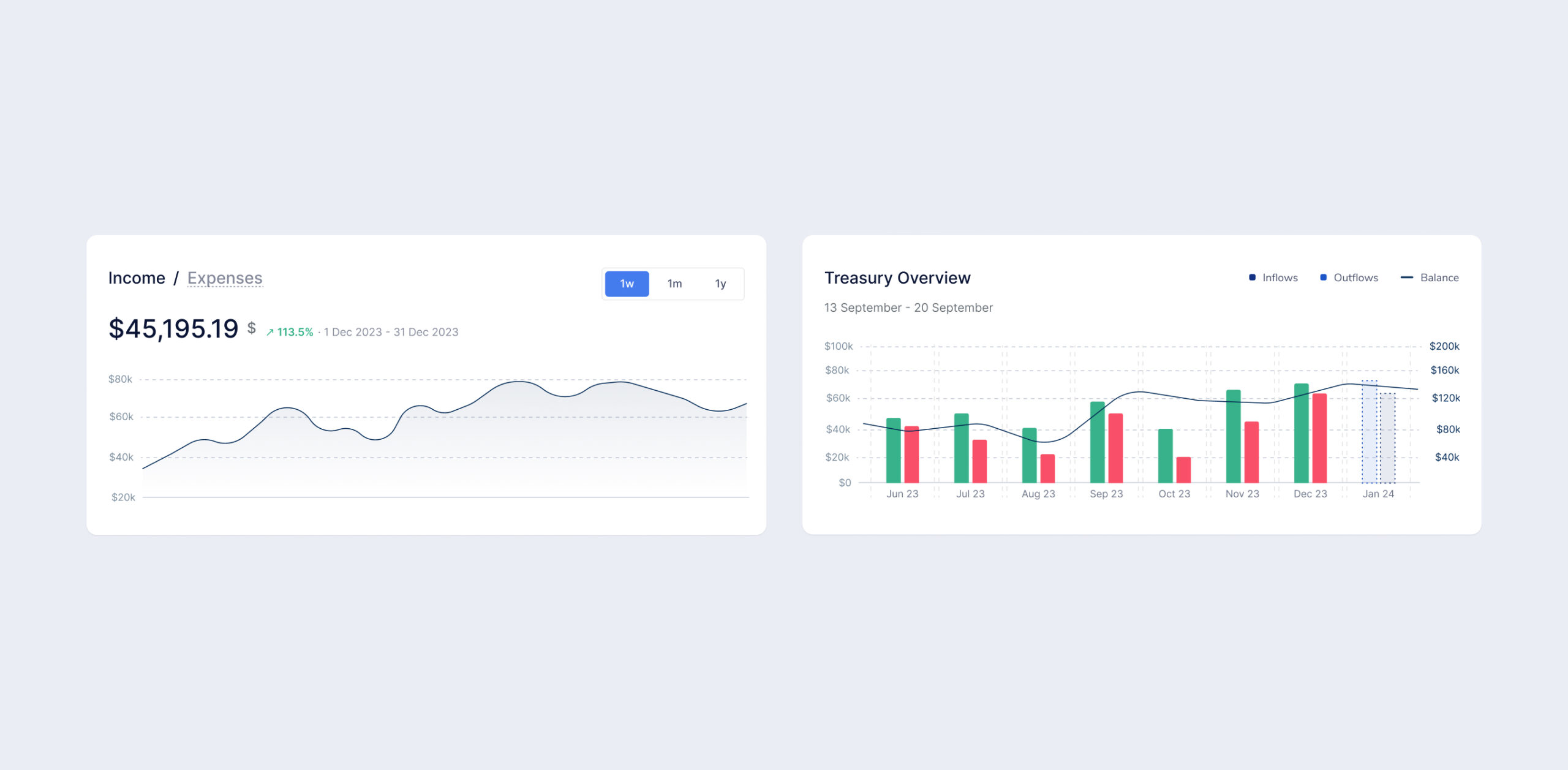
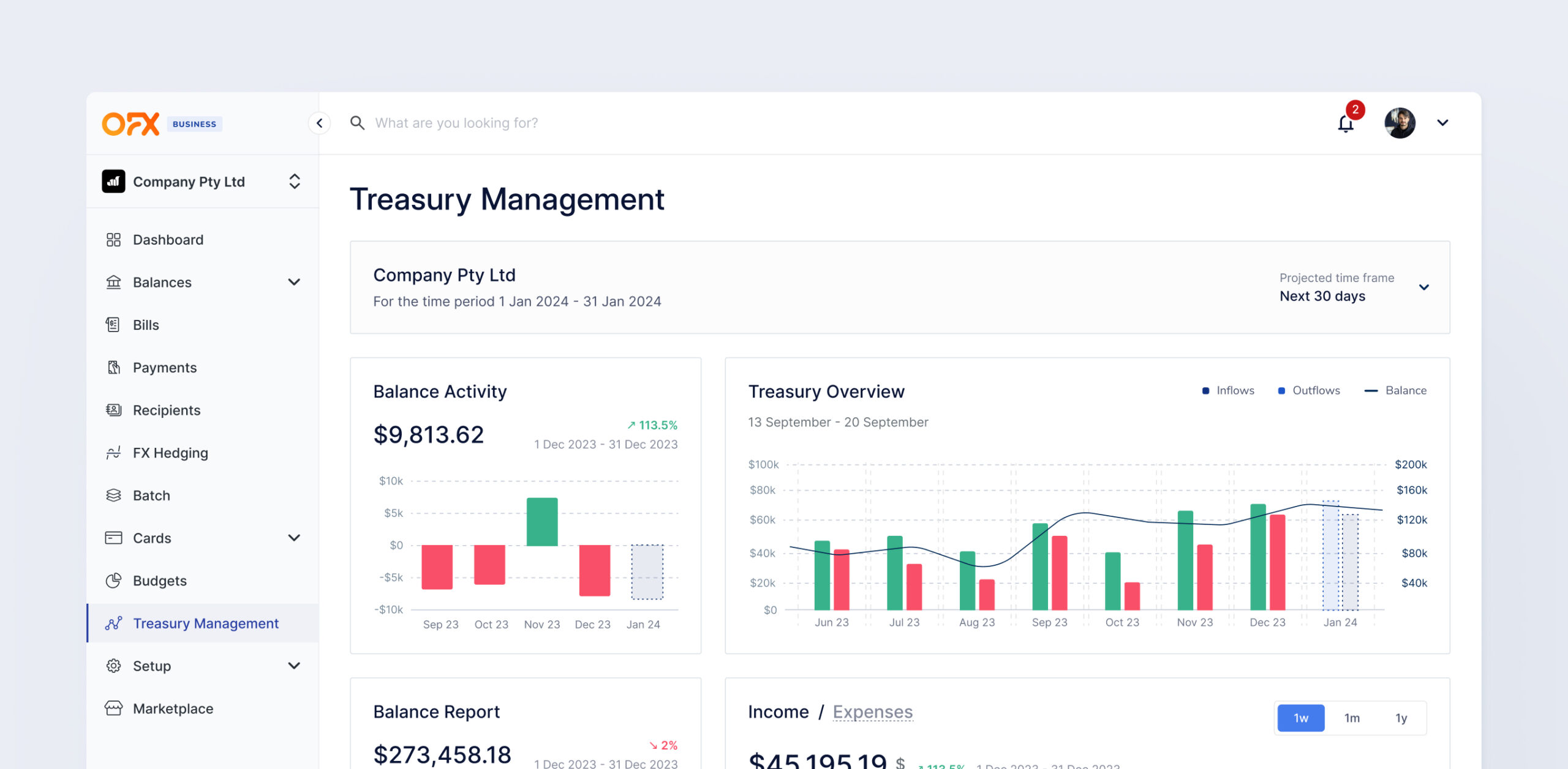
The system enabled design and development teams to move faster by standardizing core UI patterns and eliminating duplicated work across the product. It aligned both teams around shared components and workflows — reducing friction in handoff and making collaboration more efficient. Deployed across a product handling high-volume financial operations, the system helps maintain clarity and reliability in critical workflows including payments, FX, and financial management.

Reflection (What I learned)
Building a design system at scale requires aligning design consistency with team workflows — ensuring the system is not only structured, but also practical and usable over time.

This site uses cookies to offer you a better browsing experience.