OFX and durable & flexible Design System built from scratch

I had the pleasure of collaborating with OFX Company on their new design system, which aims to create sustainable products based on a single source of truth. Following the launch of the Fox Design System, I helped redesign and refine several products in the OFX portfolio, including the website, customer rate calculator, historical exchange rates, and the mobile app.
Services

Discovery, UI, UX, Design System, Prototyping

Industry

Finances

Country

Worldwide

See online
Key Achievements
  • Developed a design system for OFX, ensuring seamless unification following the acquisition of the Paytron platform, with shared design tokens integrated across all files in the library.
  • Centralized all styles within interconnected files in the library to streamline management and maintain better control.
  • Worked on the new app screen templates keeping consistency within new Design system
Challenges and Goals

The main goal of creating FOX design system was to establish a unified set of guidelines, components, and standards that ensure consistency, efficiency, and scalability across all digital products. It serves as a single source of truth, enabling teams to build cohesive, user-friendly experiences, streamline development, and maintain design quality across platforms.

Foundations

The first step in my work was focusing on the foundations. Laying the groundwork for a design system is an exciting and crucial phase in building a unified, consistent, and scalable user experience across a product or platform. I based everything on Figma variables and included the following in the foundations library:

  • Typography
  • Colors
  • Spacings
  • Elevation
  • Grid System
  • Iconography
Components library

A cornerstone of the design system, offering a centralised collection of reusable components that ensure consistency, efficiency, and scalability across the product. Every component was created using atomic design methodology. This library includes f.e.:

  • Accordions
  • Buttons
  • Charts
  • Checkboxes
  • Dropdowns
  • Forms
  • Pagination
  • Segment control
  • Radio buttons
  • Table
Patterns

The next part of my job was to prepare the patterns section to showcase reusable design solutions tailored for specific use cases and workflows within the product. I combined components into structured layouts and interactions to address common user needs and scenarios. This library includes f.e.:

  • Navigation
  • Search results
  • Wizard
  • Widgets
Governance and Communication

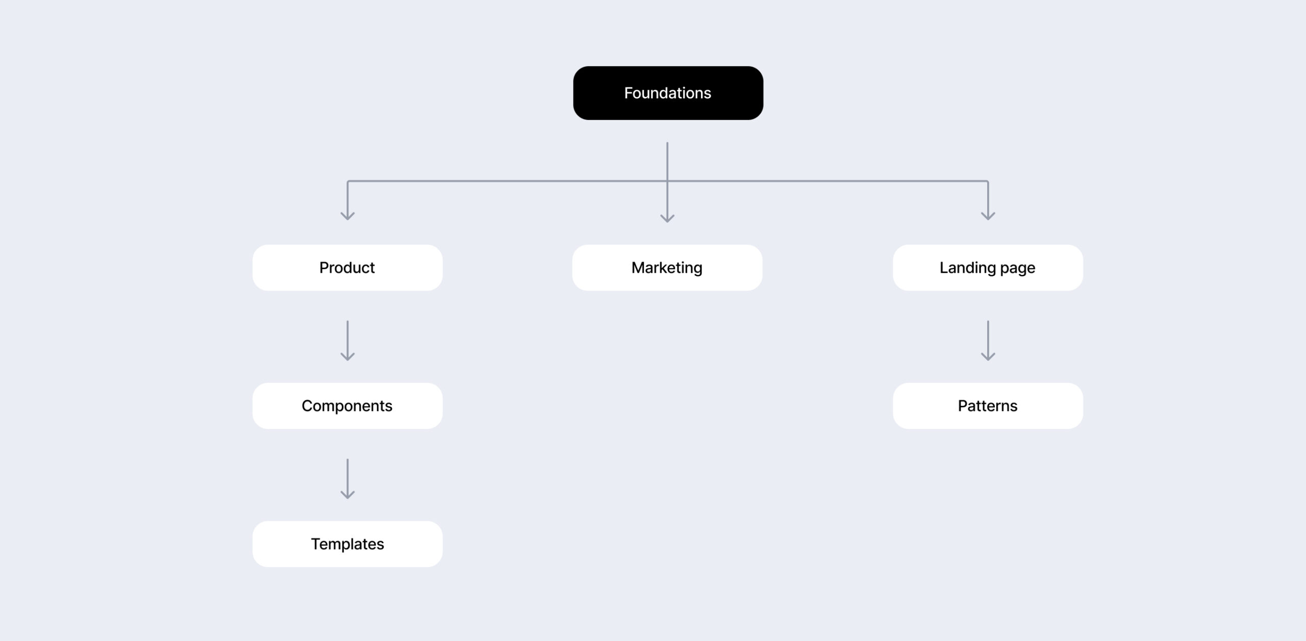
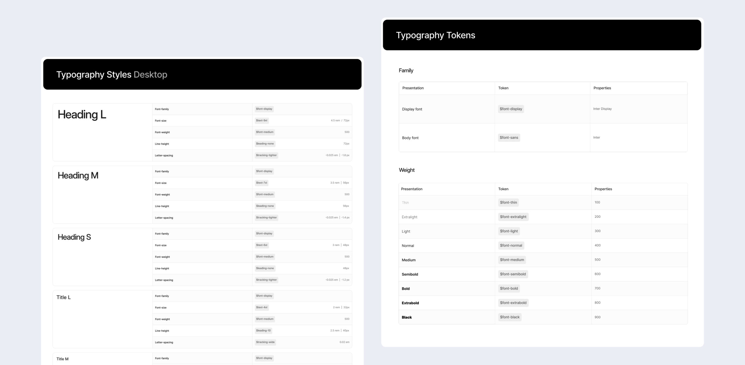
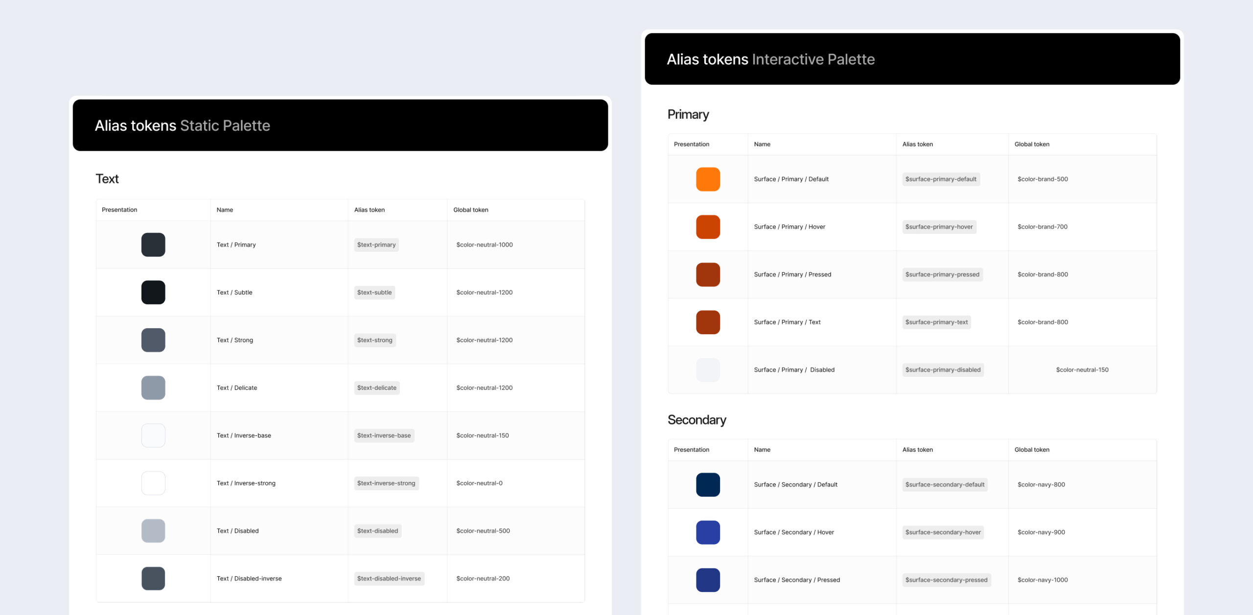
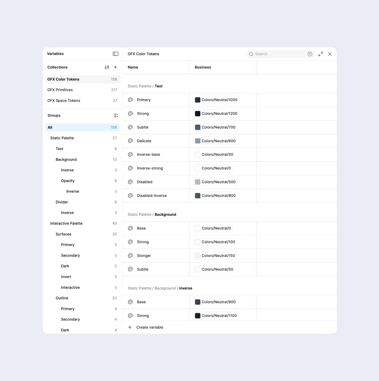
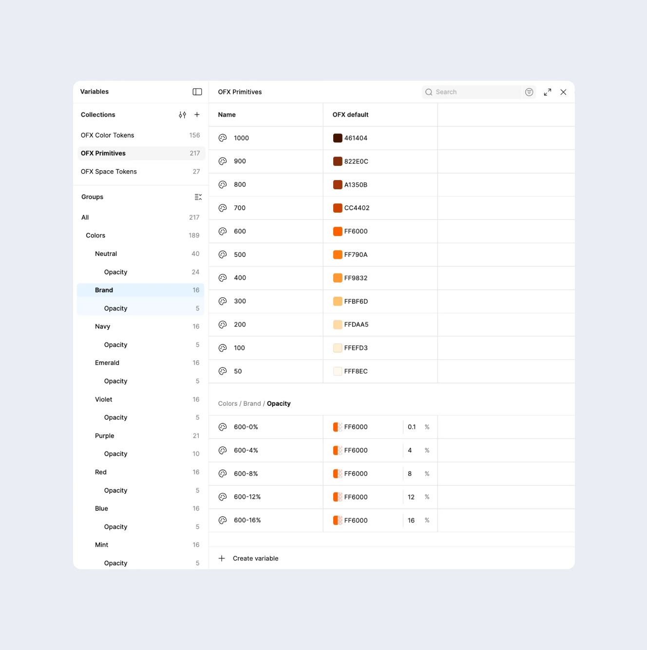
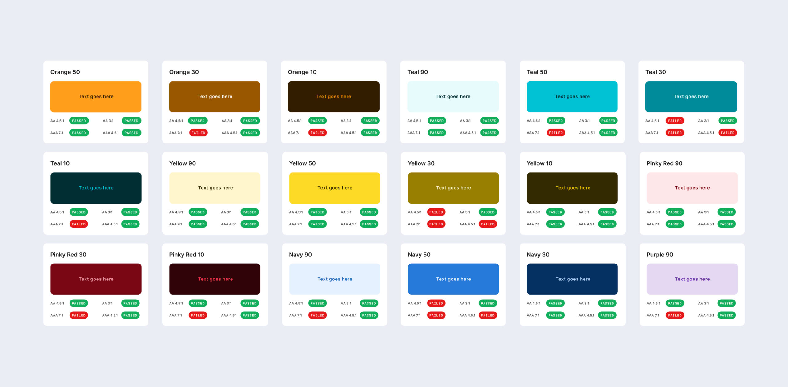
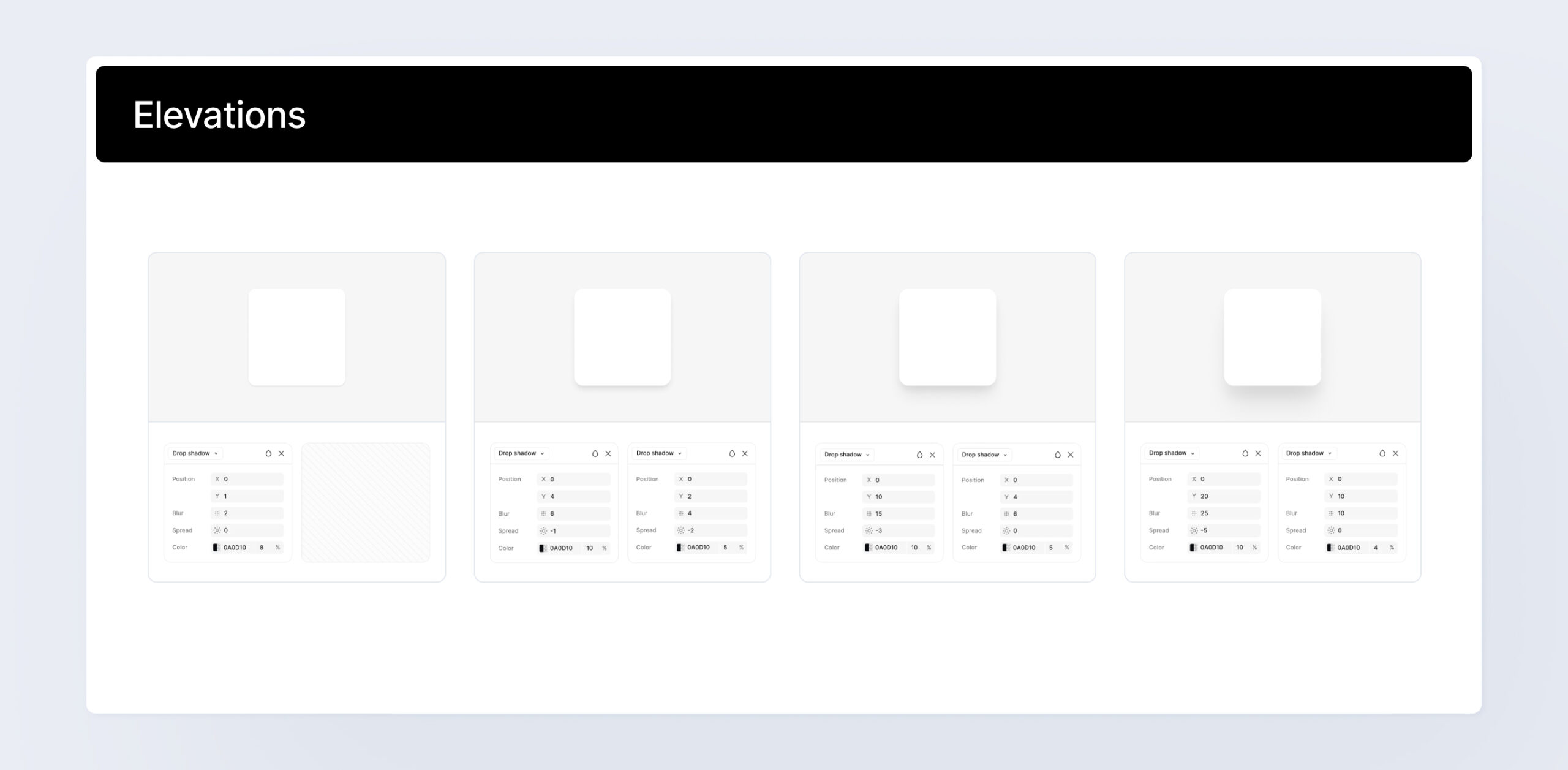
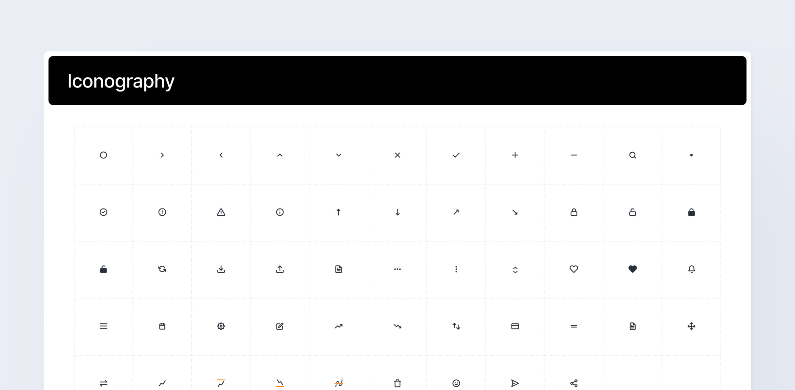
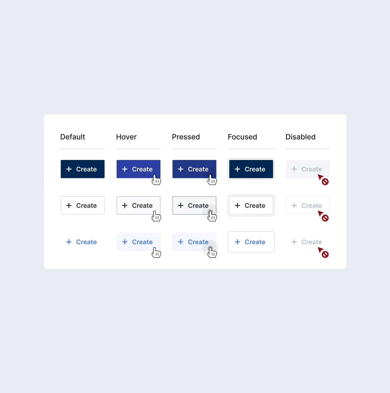
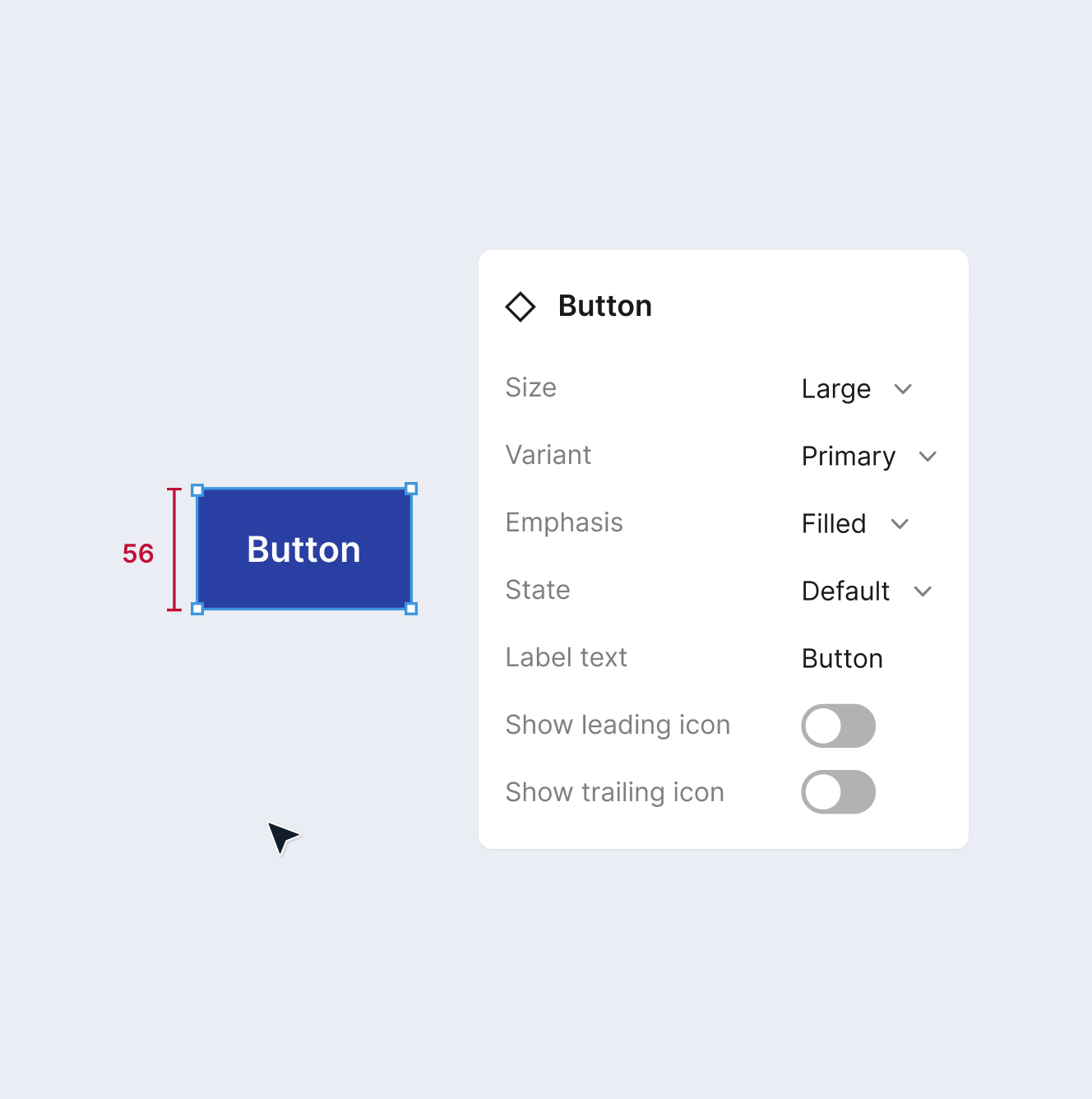
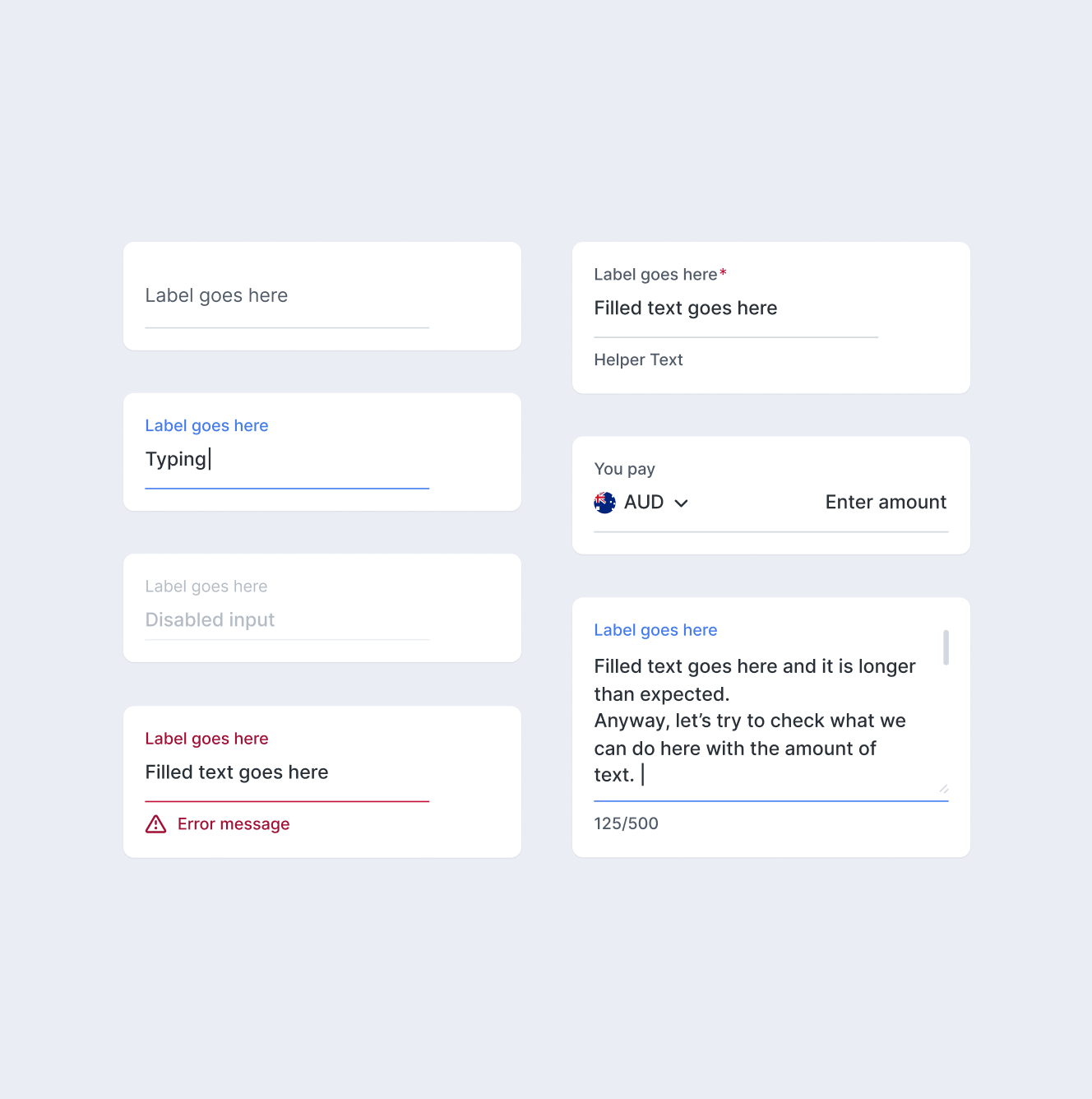
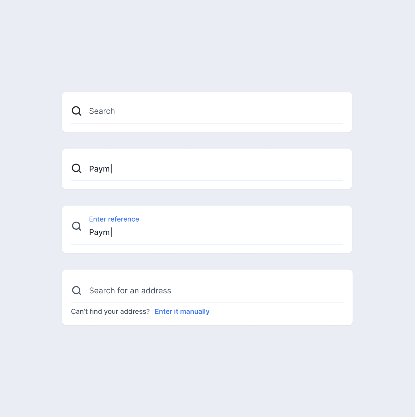
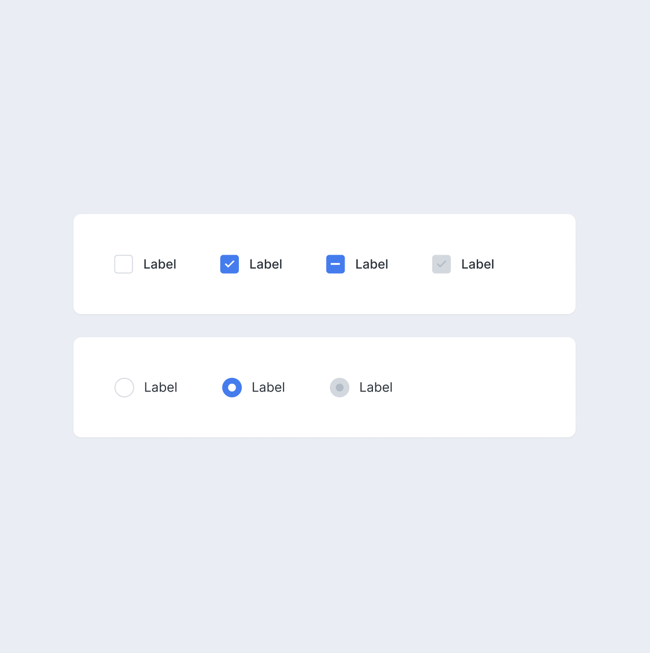
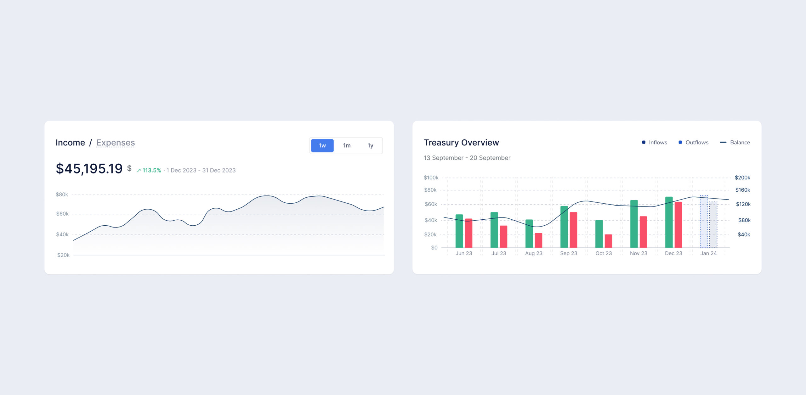
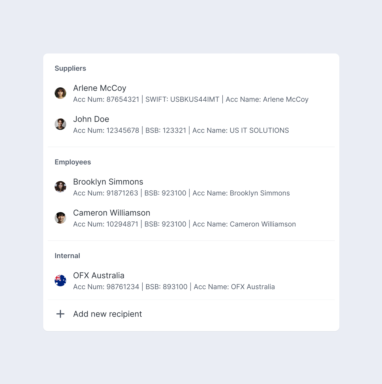
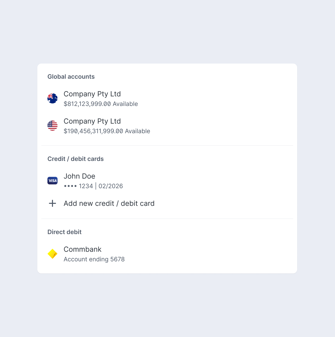
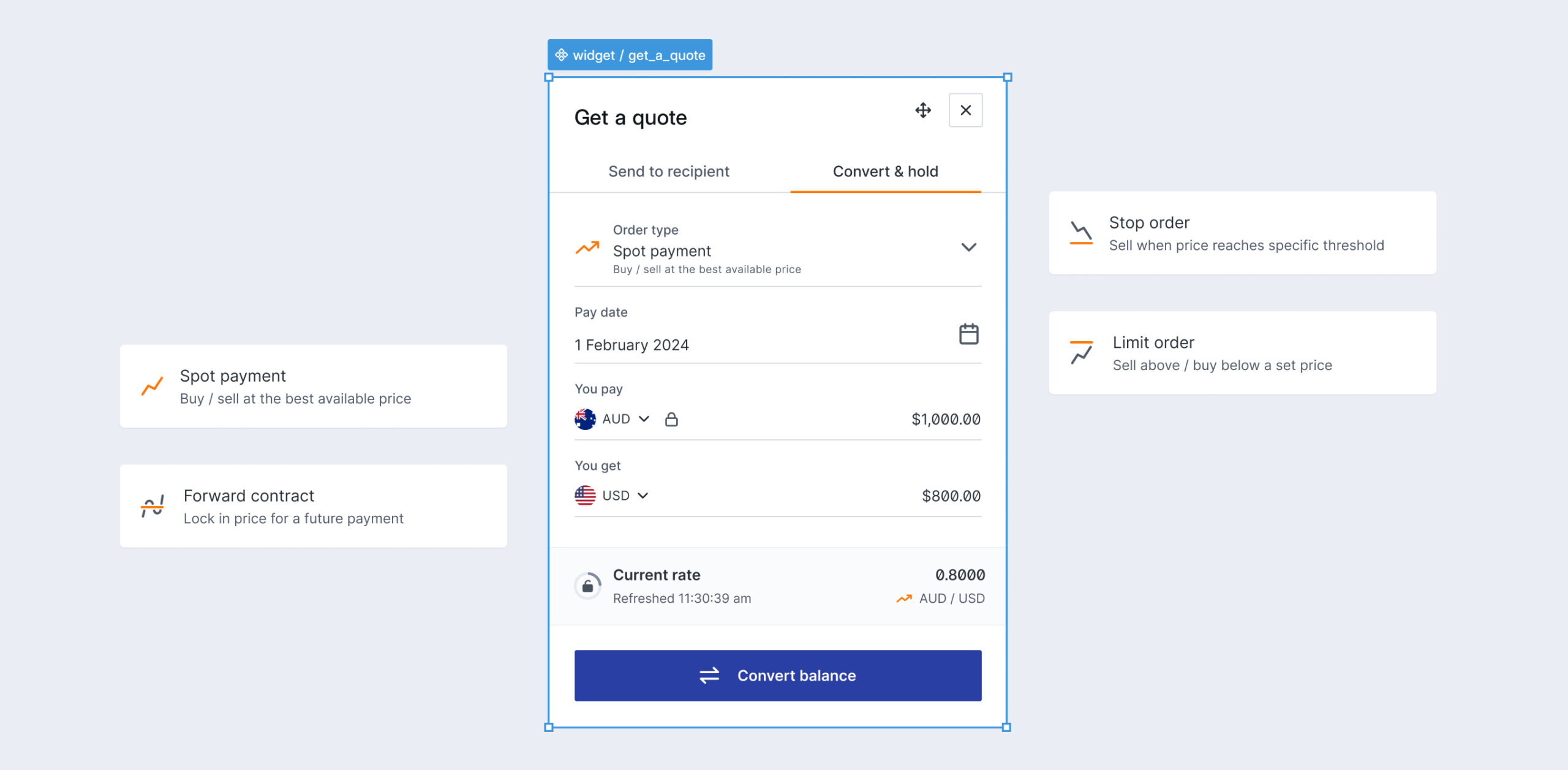
Throughout the creation process, I made it a priority to thoroughly document every component and pattern. This decision was driven by the need to ensure clarity, consistency, and ease of use for all stakeholders interacting with the design system.

By prioritizing comprehensive documentation, I aimed to create a reliable resource that fosters collaboration, reduces misunderstandings, and empowers teams to build cohesive, user-centered experiences with confidence.

Key takeaways

The introduction of the new design system brought significant improvements to various aspects of the products while enhancing collaboration between designers and developers. By using design tokens and components, we established a shared language that bridged the gap between teams.

Consolidating two separate libraries into a unified design system proved to be a major productivity boost for the design team. Coupled with a well-structured Figma library, this streamlined approach greatly improved efficiency, enabling smoother workflows and faster project execution.

This site uses cookies to offer you a
better browsing experience.

M©

This site uses cookies to offer you a
better browsing experience.

This site uses cookies to offer you a
better browsing experience.